Spatial density latitudinal lines for COVID-19
Background
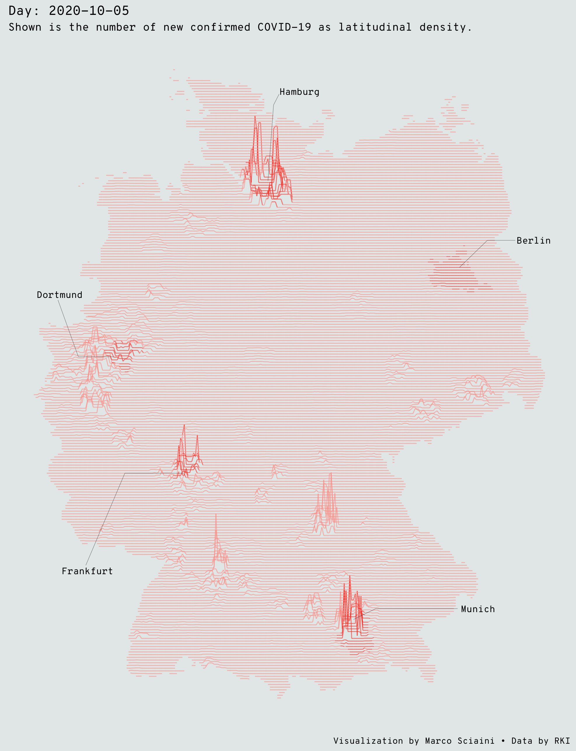
Inspired by James Cheshire’s Population Lines Print and Ryan Brideau, I wanted to track the spatial Pattern of the COVID-19 in Germany over time. This map shows the density of confirmed cases COVID-19 cases by latitude.
The data comes from the covid19germany package, which was developed in the context of the #WirvsVirus hackathon. The package loads the data from the Bundesamt für Kartographie und Geodäsie as well as the Robert Koch Institut.
With the code in this project, you can either visualize the COVID-19 density for a single day or animte a certain timespan via gganimate. Since the spatial nature of our data, this animation … will take some time and computing resources.
Come along!
Setup
First, we will need a bunch of R packages - tidyverse for our data wrangling, covid19germany for the COVID-19 data, sf, stars, landscapetools and fasterize for our spatial data wrangling, and gganimate and extrafont to enrich our vis magic!
library(tidyverse)
library(covid19germany)
library(sf)
library(stars)
library(landscapetools)
library(fasterize)
library(gganimate)
library(extrafont)
extrafont allows us to use our systemfonts, later I assume that you have the Google font Mono installed. Otherwise, ggplot will fall back to a default font.
extrafont::loadfonts(quiet = TRUE)
Turning polygons in raster
Then, we will load timeseries data for COVID-19 on NUTS-3 level for Germany and merge it with a GADM polygon to make it spatial. To be able to plot our spatial density lines, we have to turn our polygons into a raster. For this, we loop through each date in our dataset, make a complete dataset (fill zero cases which are NA in our data with a 0 - meaning zero cases, which is true for this type of data). We then standardize by area since some NUTS-3 regions are a lot bigger than others.
Lastly, we coerce our freshly cleanded polygon for each date into raster and this raster immediately into a tibble with x , y, z and time as columns. We will use the x, y and z to draw our lines and the date for the animation.
# load covid and spatial data ----
cov_df <- covid19germany::get_RKI_timeseries()

con <- url("https://biogeo.ucdavis.edu/data/gadm3.6/Rsf/gadm36_DEU_3_sf.rds")
germany_sf <- readRDS(con)

# data cleaning ----
## clean weird naming of county names in covid dataframe
cov_df$Landkreis <- str_sub(cov_df$Landkreis, 4)

## make covid data spatial
germany_cov <- left_join(germany_sf, cov_df, by = c("NAME_3" = "Landkreis"))

## group by date and county and summarise number of new confirmed cases
germany_cov_clean <- germany_cov %>%
  group_by(Date, NAME_3) %>%
  summarise(SUM = sum(NumberNewTestedIll))

# data transformation ---
spatial_data <- map_dfr(na.omit(unique(germany_cov_clean$Date)), function(id_date){

  # filter for specific date
  cov_intermed <- germany_cov_clean %>%
    filter(Date == as.Date(id_date))

  # since we only have polygons where NewIll > 0, we need to join the "empty" ones
  cov_intermed <- suppressWarnings(st_join(germany_sf, cov_intermed))

  # standardize by area
  cov_intermed$SUM <- (cov_intermed$SUM / st_area(cov_intermed))

  # and since "empty" actually means 0, we are going to do this
  cov_intermed$SUM <- cov_intermed$SUM %>% replace_na(0)

  # turn the polygons to a raster and coerce this raster to a tibble
  cov_r <- raster(cov_intermed, res = 0.03320453)
  cov_intermed <- fasterize(cov_intermed, cov_r, field = "SUM", fun="sum") %>%
    landscapetools::util_raster2tibble()

  # and get the naming right
  cov_intermed <- cov_intermed %>%
    rename(lng = x, lat =y, value = z) #%>%

  cov_intermed$date <- as.Date(id_date)
  cov_intermed

})
Visualize it!
Data cleaning
There is something wrong with the data before the 08th of march apparently, two dates have the same numer of newly positve tested person … which causes a weird error from gganimate, so we start with this date.
spatial_data_df <- spatial_data %>%
  filter(date > as.Date("2020-03-08"))
We will use the five German cities Berlin, Frankfurt, Munich, Hamburg and Dortmund as points in space to give some spatial grasp to our data. Hence, we filter our sf object for Germany and repeat our data prepping steps. Lastly, we write it as a new column in our spatial_data_df object to use it later as a unique layer in our ggplot.
aoi <- c("Berlin", "Frankfurt am Main", "München", "Hamburg", "Dortmund")

aoi_poly <- germany_sf %>%
  filter(NAME_2 %in% aoi)

aoi_poly$group_id <- aoi_poly %>%
  group_by(NAME_2) %>%
  group_indices()

aoi_poly <- st_join(germany_sf, aoi_poly)
aoi_poly$group_id <- aoi_poly$group_id %>% replace_na(0)

aoi_r <- raster(aoi_poly, res = 0.03320453)
aoi_r <- fasterize(aoi_poly, aoi_r, field = "group_id", fun = "first") %>%
  landscapetools::util_raster2tibble()

aoi_r <- purrr::map_dfr(seq_len(length(unique(spatial_data_df$date))), ~aoi_r)

spatial_data_df$city <- aoi_r$z
We then define the colors we are going to use for our arrows indicating the position of the fice cities we specified and define the geometry of these arrows.
line_color = c('#fba298', "#f84d39", "#f84d39", "#f84d39", "#f84d39", "#f84d39")

arrow <- tibble(x =    c(230, 245, 127, 130, 173, 185, 82, 50, 44,  25),
                xend = c(245, 260, 130, 133, 185, 229, 50, 29, 25,  14),
                y =    c(160, 170, 192, 220, 30,  34,  84, 84, 127, 127),
                yend = c(170, 170, 220, 224, 34,  34,  84, 50, 127, 148))
gganimate
Turning this into a beautiful animation over time becomes now a breeze with gganimate …
p1 <- ggplot(spatial_data_df, aes(lng, lat + 6*(value/max(value, na.rm=TRUE)))) +
  geom_line(size = 0.35,
            alpha=0.6,
            aes(group = lat, color = factor(city)),
            na.rm=TRUE) +
  ggthemes::theme_map(base_family = "Overpass Mono") +
  labs(
    title = 'Day: {frame_time}',
    subtitle = "Shown is the number of new confirmed COVID-19 cases for each day since March, 2020.",
    caption = "Visualization by Marco Sciaini • Data by RKI"
  ) +
  transition_time(date) +
  shadow_wake(wake_length = 0.1, colour = '#5A3E37')  +
  theme(plot.background = element_rect(fill = "#e6eaeb", "#e6eaeb"),
        plot.title = element_text(size = 16),
        plot.subtitle = element_text(size = 12)) +
  scale_color_manual(values = line_color, guide = "none") +
  geom_segment(data = arrow,
               aes(x = x, xend = xend, y = y, yend = yend),
               size = 0.1,
               alpha = 0.7) +
  annotate("text", x = 270, y = 170, label = "Berlin", size = 2.7, family = "Overpass Mono") +
  annotate("text", x = 240, y = 34, label = "Munich", size = 2.7, family = "Overpass Mono") +
  annotate("text", x = 30, y = 48, label = "Frankfurt", size = 2.7, family = "Overpass Mono") +
  annotate("text", x = 15, y = 150, label = "Dortmund", size = 2.7, family = "Overpass Mono") +
  annotate("text", x = 144, y = 225, label = "Hamburg", size = 2.7, family = "Overpass Mono")

gganimate::animate(p1,
                   render = gifski_renderer(),
                   nframes = length(unique(spatial_data_df$date)),
                   width= 3458,
                   height= 3858,
                   duration = 15,
                   res = 300)

anim_save("covidlines.gif")
Caveat: This becomes a memory monster … in late November, this was 43 gb in memory.
ggplot
If we want to have look at specific dates, this becomes just the same chunk as above without the gganimate functions:
# plot a single day ----
id_date = "2020-10-05"

spatial_data_df %>%
  filter(date == as.Date(id_date)) %>%
  ggplot(aes(lng, lat + 25*(value/max(value, na.rm = TRUE)))) +
  geom_line(size = 0.35,
            alpha=0.6,
            aes(group = lat, color = factor(city)),
            na.rm=TRUE) +
  ggthemes::theme_map(base_family = "Overpass Mono") +
  labs(
    title = paste("Day:", id_date),
    subtitle = "Shown is the number of new confirmed COVID-19 as latitudinal density.",
    caption = "Visualization by Marco Sciaini • Data by RKI"
  ) +
  theme(plot.background = element_rect(fill = "#e6eaeb", "#e6eaeb")) +
  scale_color_manual(values = line_color, guide = "none") +
  geom_segment(data = arrow,
               aes(x = x, xend = xend, y = y, yend = yend),
               size = 0.1,
               alpha = 0.7) +
  annotate("text", x = 270, y = 170, label = "Berlin", size = 2.7, family = "Overpass Mono") +
  annotate("text", x = 240, y = 34, label = "Munich", size = 2.7, family = "Overpass Mono") +
  annotate("text", x = 30, y = 48, label = "Frankfurt", size = 2.7, family = "Overpass Mono") +
  annotate("text", x = 15, y = 150, label = "Dortmund", size = 2.7, family = "Overpass Mono") +
  annotate("text", x = 144, y = 225, label = "Hamburg", size = 2.7, family = "Overpass Mono")

ggsave("covidlines.png", width = 6.58, height = 8.58)
Summary
Turning COVID-19 timeseries data into a spatial animation with a strong hinche of Joy Division solely relying on R Stats tools? No problem … It is just awesome that there is an R package for everything!
If you have any feedback on code/visualisition - get in touch, would love to chat about it. Otherwise, here is the full code to get to the animation or static plot:
library(tidyverse)
library(sf)
library(covid19germany)
library(stars)
library(gganimate)
library(fasterize)
library(extrafont)
library(landscapetools)

# load font ----
extrafont::loadfonts(quiet = TRUE)

# load covid and spatial data ----
cov_df <- covid19germany::get_RKI_timeseries()

con <- url("https://biogeo.ucdavis.edu/data/gadm3.6/Rsf/gadm36_DEU_3_sf.rds")
germany_sf <- readRDS(con)

# data cleaning ----
## clean weird naming of county names in covid dataframe
cov_df$Landkreis <- str_sub(cov_df$Landkreis, 4)

## make covid data spatial
germany_cov <- left_join(germany_sf, cov_df, by = c("NAME_3" = "Landkreis"))

## group by date and county and summarise number of new confirmed cases
germany_cov_clean <- germany_cov %>%
  group_by(Date, NAME_3) %>%
  summarise(SUM = sum(NumberNewTestedIll))

# data transformation ---
spatial_data <- map_dfr(na.omit(unique(germany_cov_clean$Date)), function(id_date){

  # filter for specific date
  cov_intermed <- germany_cov_clean %>%
    filter(Date == as.Date(id_date))

  # since we only have polygons where NewIll > 0, we need to join the "empty" ones
  cov_intermed <- suppressWarnings(st_join(germany_sf, cov_intermed))

  # standardize by area
  cov_intermed$SUM <- (cov_intermed$SUM / st_area(cov_intermed))

  # and since "empty" actually means 0, we are going to do this
  cov_intermed$SUM <- cov_intermed$SUM %>% replace_na(0)

  # turn the polygons to a raster and coerce this raster to a tibble
  cov_r <- raster(cov_intermed, res = 0.03320453)
  cov_intermed <- fasterize(cov_intermed, cov_r, field = "SUM", fun="sum") %>%
    landscapetools::util_raster2tibble()

  # and get the naming right
  cov_intermed <- cov_intermed %>%
    rename(lng = x, lat =y, value = z) #%>%

  cov_intermed$date <- as.Date(id_date)
  cov_intermed

})

# animate as gif ----
## there is something wrong with the data before the 08th of march
## apparently, two dates have the same numer of newly positve tested person
## ... which causes a weird error from gganimate, so we start with this date
spatial_data_df <- spatial_data %>%
  filter(date > as.Date("2020-03-08"))


aoi <- c("Berlin", "Frankfurt am Main", "München", "Hamburg", "Dortmund")

aoi_poly <- germany_sf %>%
  filter(NAME_2 %in% aoi)

aoi_poly$group_id <- aoi_poly %>%
  group_by(NAME_2) %>%
  group_indices()

aoi_poly <- st_join(germany_sf, aoi_poly)
aoi_poly$group_id <- aoi_poly$group_id %>% replace_na(0)

aoi_r <- raster(aoi_poly, res = 0.03320453)
aoi_r <- fasterize(aoi_poly, aoi_r, field = "group_id", fun = "first") %>%
  landscapetools::util_raster2tibble()

aoi_r <- purrr::map_dfr(seq_len(length(unique(spatial_data_df$date))), ~aoi_r)

spatial_data_df$city <- aoi_r$z


line_color = c('#fba298', "#f84d39", "#f84d39", "#f84d39", "#f84d39", "#f84d39")

arrow <- tibble(x =    c(230, 245, 127, 130, 173, 185, 82, 50, 44,  25),
                xend = c(245, 260, 130, 133, 185, 229, 50, 29, 25,  14),
                y =    c(160, 170, 192, 220, 30,  34,  84, 84, 127, 127),
                yend = c(170, 170, 220, 224, 34,  34,  84, 50, 127, 148))

p1 <- ggplot(spatial_data_df, aes(lng, lat + 6*(value/max(value, na.rm=TRUE)))) +
  geom_line(size = 0.35,
            alpha=0.6,
            aes(group = lat, color = factor(city)),
            na.rm=TRUE) +
  ggthemes::theme_map(base_family = "Overpass Mono") +
  labs(
    title = 'Day: {frame_time}',
    subtitle = "Shown is the number of new confirmed COVID-19 cases for each day since March, 2020.",
    caption = "Visualization by Marco Sciaini • Data by RKI"
  ) +
  transition_time(date) +
  shadow_wake(wake_length = 0.1, colour = '#5A3E37')  +
  theme(plot.background = element_rect(fill = "#e6eaeb", "#e6eaeb"),
        plot.title = element_text(size = 16),
        plot.subtitle = element_text(size = 12)) +
  scale_color_manual(values = line_color, guide = "none") +
  geom_segment(data = arrow,
               aes(x = x, xend = xend, y = y, yend = yend),
               size = 0.1,
               alpha = 0.7) +
  annotate("text", x = 270, y = 170, label = "Berlin", size = 2.7, family = "Overpass Mono") +
  annotate("text", x = 240, y = 34, label = "Munich", size = 2.7, family = "Overpass Mono") +
  annotate("text", x = 30, y = 48, label = "Frankfurt", size = 2.7, family = "Overpass Mono") +
  annotate("text", x = 15, y = 150, label = "Dortmund", size = 2.7, family = "Overpass Mono") +
  annotate("text", x = 144, y = 225, label = "Hamburg", size = 2.7, family = "Overpass Mono")

gganimate::animate(p1,
                   render = gifski_renderer(),
                   nframes = length(unique(spatial_data_df$date)),
                   width= 3458,
                   height= 3858,
                   duration = 15,
                   res = 300)

anim_save("covidlines.gif")


# plot a single day ----
id_date = "2020-10-05"

spatial_data_df %>%
  filter(date == as.Date(id_date)) %>%
  ggplot(aes(lng, lat + 25*(value/max(value, na.rm = TRUE)))) +
  geom_line(size = 0.35,
            alpha=0.6,
            aes(group = lat, color = factor(city)),
            na.rm=TRUE) +
  ggthemes::theme_map(base_family = "Overpass Mono") +
  labs(
    title = paste("Day:", id_date),
    subtitle = "Shown is the number of new confirmed COVID-19 as latitudinal density.",
    caption = "Visualization by Marco Sciaini • Data by RKI"
  ) +
  theme(plot.background = element_rect(fill = "#e6eaeb", "#e6eaeb")) +
  scale_color_manual(values = line_color, guide = "none") +
  geom_segment(data = arrow,
               aes(x = x, xend = xend, y = y, yend = yend),
               size = 0.1,
               alpha = 0.7) +
  annotate("text", x = 270, y = 170, label = "Berlin", size = 2.7, family = "Overpass Mono") +
  annotate("text", x = 240, y = 34, label = "Munich", size = 2.7, family = "Overpass Mono") +
  annotate("text", x = 30, y = 48, label = "Frankfurt", size = 2.7, family = "Overpass Mono") +
  annotate("text", x = 15, y = 150, label = "Dortmund", size = 2.7, family = "Overpass Mono") +
  annotate("text", x = 144, y = 225, label = "Hamburg", size = 2.7, family = "Overpass Mono")

ggsave("covidlines.png", width = 6.58, height = 8.58)